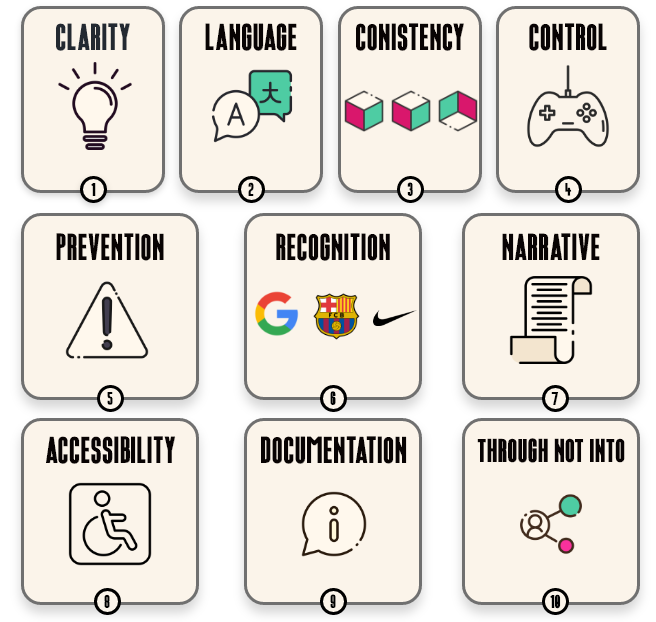
1. Clarity is King
In the realm of sports analytics, achieving clarity is absolutely essential. It's not just about presenting data; it's about transforming intricate statistics into visuals that anyone, from coaches to fans, can easily comprehend. This means stripping away the complexity and focusing on simplicity. Clean, uncluttered designs are our bread and butter. We steer clear of unnecessary embellishments that could divert attention from the main takeaway. Every element serves a purpose, guiding the viewer's eye to the heart of the message..
2. Speak Their Language
Designing effectively involves more than just creating stories; it's about crafting narratives that truly connect with your stakeholders. Often, we unintentionally veer into the realm of technical jargon, which can alienate rather than engage our audience. Instead, our goal should be to speak their language, both figuratively and literally. This means not only using terms and visuals that resonate with them but also understanding their unique communication style. Stakeholders might have specific phrases, idioms, or even non-verbal cues that are meaningful to them. By tapping into these nuances, we can create designs that not only speak to their intellect but also to their hearts, fostering a deeper sense of connection and understanding. While something may be perfectly clear to you, it might leave your stakeholders scratching their heads. That's why it's crucial to always put their needs first. We all remember the classic ‘Acute and Chronic Workload Ratio’ something as simple as renaming this the ‘Fitness & Fatigue Ratio’ could help stakeholders grasp the data more swiftly.

3. Consistency Counts
Consistency is and users shouldn't have to second-guess whether different terms or actions convey the same meaning. By using standards principles, we ensure a seamless experience that feels intuitive to stakeholders. Remember users spend the most of their time engaging with other digital products which essentially shapes their expectations, making consistency essential. Deviating from established norms not only risks confusing users but also increases their cognitive load as they navigate unfamiliar territory. Consistency for example involves maintaining uniformity in colours, fonts, and chart types across all visuals. For instance, if red always represents losses and green represents wins, users will quickly grasp the trends in a dataset without needing to decode the colours each time.
4. Give Control, Provide Freedom
Empowering users with control and providing them with freedom is crucial in creating a positive user experience. Users should have the ability to explore different scenarios and rectify mistakes effortlessly. Features such as 'undo' for analysis steps, flexible filtering options, and the capability to reset views play a pivotal role in giving users control over their experience. For example, enabling users to toggle between different data views or revert to previous states enhances their capability to manage data effectively. By offering these features, users feel empowered and confident in navigating the system, ultimately leading to a more satisfying user experience.
5. Prevent errors early
Preventing errors in data entry and analysis is vital. Implementing confirmation dialogs before deleting data, providing clear error messages for incorrect inputs, and using constraints to prevent invalid entries are essential. For example, a dashboard that flags invalid data formats or provides dropdowns with valid options can prevent user errors.
6. Recognition Rather Than Recall

Recognition rather than recall is a fundamental principle in design. When users interact with a dashboard or report, they should not have to strain their memory to remember information. Recognition is the effortless process of identifying something familiar. It requires minimal cognitive effort as the information is readily available.
On the other hand, recall involves retrieving information from memory, which demands more mental effort. For instance, recalling names, years, or specific details requires activating multiple memory chunks.
In a user interface, it's essential to minimise the need for recall. Instead, all options and information should be readily available to users. This can be achieved through intuitive design elements such as icons or text menus, which allow users to quickly scan and select desired features without having to rely on memory. Providing visual cues, such as icons or specific colours for related functions, aids users in remembering information effortlessly.
Additionally, well-designed information architecture ensures that users can easily locate the information they need without resorting to memory-intensive searches. By prioritising recognition over recall, user interfaces become more user-friendly and intuitive, enhancing the overall user experience.
7. Narrative Flow
Crafting an effective data presentation mirrors the art of storytelling, where a clear beginning, middle, and end are essential components. Just as a well-constructed narrative captivates its audience, structuring your data in a logical sequence ensures that users can seamlessly navigate through the insights you're presenting.
The beginning of your data presentation sets the stage, introducing the context and objectives of the analysis. It's akin to establishing the setting and characters in a story, providing users with the necessary background information to understand the significance of the data.
As the presentation progresses into the middle section, the focus shifts to the core analysis and findings. This is where the narrative unfolds, revealing key insights and trends uncovered from the data. Like the rising action in a story, this section builds momentum, drawing users deeper into the story of the data.
Finally, the end of the presentation brings closure, summarizing the main findings and implications. Similar to the resolution of a story, this section ties up loose ends and leaves users with a clear understanding of the conclusions drawn from the data analysis.
By structuring your data presentation with a clear beginning, middle, and end, you guide users through a cohesive narrative, making it easier for them to digest complex information and derive actionable insights.
8. Accessibility
Designing for accessibility ensures that your visuals are usable by as many people as possible. This includes considerations like colour contrast for colourblind users, ensuring text is readable at various sizes, and providing alternative text for visual elements.
9. Documentation
While an ideal dashboard/report should be intuitive enough to operate without the need for additional explanation, there are instances where providing help and documentation becomes necessary to assist users. When offering help and documentation, it's crucial to ensure that the content is easily accessible and focused on addressing the user's specific needs. This means making it easy to search for relevant information and presenting it in a clear and concise manner. Additionally, keeping documentation concise and to the point helps prevent information overload and ensures that users can easily find the information they need without having to sift through unnecessary details.


10. Through Not Into
Designing for accessibility in sports analytics is not a solitary endeavour; it's a collaborative process that involves engaging stakeholders throughout the journey, rather than just presenting finished products to them. Collaboration in this context means actively involving stakeholders, such as coaches, analysts, players, and fans, in the design and development process from start to finish.
By embracing a collaborative approach, we can gain valuable insights into the diverse needs and perspectives of stakeholders. This could mean working closely with coaches to understand their requirements, collaborating with analysts to identify data visualisation preferences, and engaging with players to gather feedback on usability and functionality. Moreover, collaboration goes beyond consultation; it involves fostering a culture of inclusivity and shared ownership. This means empowering stakeholders to actively participate in decision-making processes, encouraging open dialogue, and co-creating solutions that address their specific needs and challenges. Incorporating stakeholders into the design process from the start fosters a sense of ownership and investment in the final product. It ensures that the resulting dashboards and analytics are not only technically sound but also resonate with end-users on a deeper level.
Conclusion
At Cre8 Labs, we harness these principles to turn intricate sports performance data into engaging visual narratives and actionable insights. By prioritising clarity, consistency, contextual relevance, interactivity, data integrity, narrative flow, accessibility, emotional engagement, and continuous improvement, we help sports organisations unlock the true potential of their data. Join us on this journey of transforming sports analytics into stories that drive success and informed decision-making. Let’s harness the power of data to make every moment on the field count.